Quick Take for Scroll Comics: Vertical scrolling changes graphic storytelling by turning the page into a controlled reading path. Instead of asking readers to scan a full page, the creator uses distance, reveal, panel size, and phone-screen rhythm to decide when a beat lands.
Vertical scrolling changes graphic storytelling by turning the page into a controlled reading path. Instead of asking readers to scan a full page, the creator uses distance, reveal, panel size, and phone-screen rhythm to decide when a beat lands.
What changes when the page becomes a scroll?
A printed comics page gives the reader a whole composition at once. The eye can jump to a splash panel, notice a color change, or accidentally glimpse a surprise before reading the setup. A webtoon works differently. The screen usually shows a narrow portion of the episode, so the creator controls sequence more tightly. This makes timing feel closer to editing in film: a face appears, the reader swipes, empty space creates a pause, and then the reaction arrives.
For new creators, WEBTOON Academy is useful because it treats format as part of publishing, not just decoration. Its creator resources reinforce the practical point behind most vertical storytelling advice: an episode must be easy to read on a phone before it can be judged as art, comedy, romance, action, or drama.
The biggest change is not simply that panels stack downward. It is that the gutter, the blank area between panels, becomes a timing tool. A short gap can feel like quick dialogue. A long fall of empty space can stretch suspense, mark a location change, or give a punchline room. That makes vertical comics especially good at surprise reveals and emotional close-ups, but it also punishes clutter. If every panel is large, every reaction is dramatic, and every gap is huge, the episode can feel slow even when the plot is busy.
Beginner questions creators usually ask first
Is a webtoon just a comic page cut into strips?
Not quite. A page can be reformatted into a scroll, but the best vertical comics are planned around the scroll from the start. Traditional pages use left-to-right or right-to-left page architecture, panel grids, and double-page impact. Vertical comics use progressive disclosure. That means the artist can hide the next beat below the fold and build anticipation through motion.
Does vertical scrolling make stories more cinematic?
It can, but that comparison has limits. Webtoon pacing often borrows from film editing because reveals happen in sequence. Still, the reader controls the speed. A reader may linger on a panel or fly through a chase. The creator can guide rhythm with spacing and visual weight, not fully control it like a director controls a cut.
Why do webtoons use so much empty space?
Empty space is not wasted space when it is intentional. It can separate speakers, slow down a confession, suggest silence, or signal a new location. The risk is padding. If the gap does not change the emotional or informational beat, it may only make the reader scroll more.
How vertical format changes reader experience
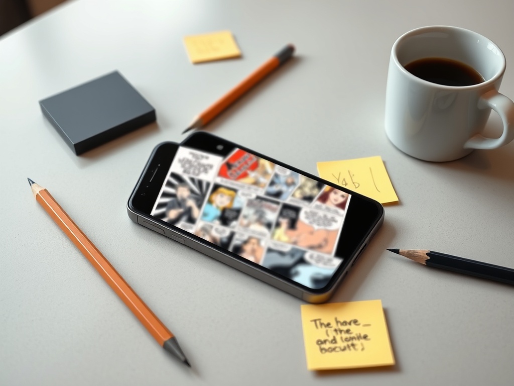
Vertical scrolling favors clarity, intimacy, and serial rhythm. Characters can occupy the phone screen like a portrait. Reaction shots become larger than they might be on a print page. Dialogue can be paced line by line instead of clustered in several balloons on one spread. This works well for romance, slice-of-life, horror, and character comedy because the format makes facial expression and silence easy to emphasize.
The trade-off is that vertical format can flatten complex spatial action. A fight scene, dance sequence, or ensemble comedy may need careful staging so the reader understands where bodies are in relation to each other. That is one reason visual production choices matter across formats; the same production pressure appears in animation and visual effects outsourcing, where clarity, schedule, and style consistency must all be managed at once.
Readers also experience cliffhangers differently. In print, a page turn can hide a reveal. In vertical scrolling, the reveal can sit just below the visible screen. The creator can build a tiny suspense loop every few swipes. That makes the format powerful for serial platforms, but it can encourage overuse of micro-cliffhangers if every episode ends with an artificial pause instead of a meaningful story question.
| Storytelling element | In a print page | In a vertical webtoon |
|---|---|---|
| Panel layout | A full page composition guides the eye across multiple panels. | A narrow sequence guides the reader through one beat at a time. |
| Pacing | Page turns, panel size, and grid changes create rhythm. | Scroll distance, blank space, and below-the-fold reveals create rhythm. |
| Surprise | Readers may glimpse later panels before the reveal. | The next image can stay hidden until the swipe. |
| Action | Large page geography can show movement and space. | Action needs simplified staging or repeated orientation panels. |
Where vertical scrolling helps most
The format shines when a story depends on emotional timing. A character who hesitates before answering, a creature revealed from the shadows, or a joke that needs a pause can all gain power from the scroll. It also supports binge reading because episodes flow without the physical interruption of page turns. For mobile-first audiences, that smoothness is part of the appeal.
Genre expectations still matter. A reader who enjoys clear labels may also appreciate how gaming genre terms shape buying decisions, because both comics platforms and game stores rely on shorthand to help people choose quickly. In webtoons, tags can attract readers, but format keeps them reading.
Common mistakes to avoid before publishing
- Do not use print-sized lettering. Phone readers should not need to pinch and zoom.
- Do not stretch every dramatic beat. Reserve long gaps for moments that need silence or suspense.
- Do not hide basic geography. Re-establish the room, street, or battlefield when action changes direction.
- Do not let effects overpower comprehension. Speed lines, blur, and vertical falls should support the story beat.
- Do not treat upload specs as creative advice. Specs tell you what the platform accepts; pacing tells you what the reader feels.
The official WEBTOON Help Center explains CANVAS as a self-publishing platform, while professional drawing guides such as Clip Studio Paints vertical webtoon tutorial focus on format, panel division, and phone readability. Read those as complementary resources: one tells you how the platform works, and the other helps you think like a scroll-first storyteller.
WEBTOON CANVAS publishing guidance is the safer place for platform questions, while vertical scrolling drawing guidance can help creators translate story beats into readable panels.
A practical way to test an episode
Before release, read the episode on the smallest phone you expect readers to use. Scroll with one thumb at normal speed. Mark any place where you had to stop for the wrong reason: text too small, action unclear, a repeated reaction, or a gap that felt empty instead of suspenseful. Then ask one test reader what they remembered. If they remember the emotional beats in order, the scroll is working. If they only remember that the episode felt long, the layout needs tightening.
Your first scroll-first revision pass
Start with the reader path. Every panel should answer one question: what does the reader need to see now? Once that path is clean, use spacing for emphasis and not decoration. A strong webtoon does not abandon comics language. It adapts composition, timing, and surprise to a screen that moves downward in the readers hand.